Western
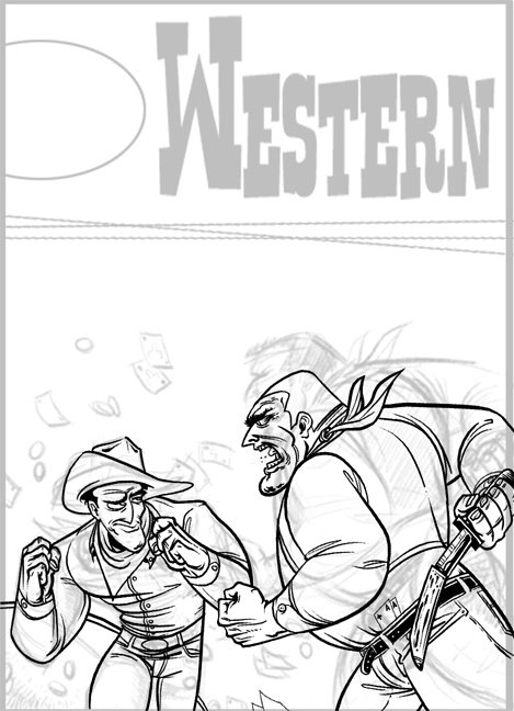
Hey ya'll. I was looking at some reference this morning trying to figure out what I'd draw today and I ran across this cover for an old 50's pulp magazine. I thought it was really cool and wanted to draw my version of it. This is just a sketch with some inks on it, nowhere near done, but I think it's turning out okay so I figured I'd post a Work In Progress.
I can already tell the original cover is staged much better than mine. I flattened it out for some reason, while the original had so much depth. Mine looks like the two guys are right next to each other. Blargh. Oh well, I still like how it's coming out.


8 comments:
I think the reason why they dont have a different depth is becuase the guy on the right is further away from the guy on the right and he is also a little more upright- notice the original picture and compare the relationship of the guy on the rights mouth to the rim of the hat on the guy on the left. Also, once you determine the shadows you can probably counter the flatness of it. On a side note, I like the facial expressions you put on them, they have a more interesting story than portrayed in the original. The guy on the left looks more shifty and looks more likely to fight dirty. heh.
Hot sausage, this is sweet! The expressions are aces and the linework is amazing. I love the pose and folds on the guy on the left.
I think you know it's good, so I'll just leave and let you finish it.
haha, thanks Kris. Yeah, I'm aware of why it's flatter, I was just pondering how I got so far into the drawing without realizing it. It happens to me alot, random bouts of stupidity. Thanks for the input.
Sick: yeah...I dunno. I'll eaither re-attack it, or never finish it. I don't like it.
VEry coool drawings !! YOur line quality is very goood!!
Dude,
koa guy said what I was thinking of...but besides that I love the expressions you've given the guys. That Kirk Douglas cowboy is totally like "Bring it" and "Whatever" with the same lift of an eyebrow!
Nice.
j.
you could easily open the depth up with color. Just make the guy who's further away a bit lower contrast and less saturated and he'll drop back in space.
-ebo
Nice drawing!
I have no problems with the two characters myself. They're really solidly drawn.
I would make the guy pulling out the knife much closer to the camera, so he seems larger and more imposing.
Really you could probably just fit his face in near the top and have most of the screen be taken up with the hand and knife.
Good reeading your post
Post a Comment